

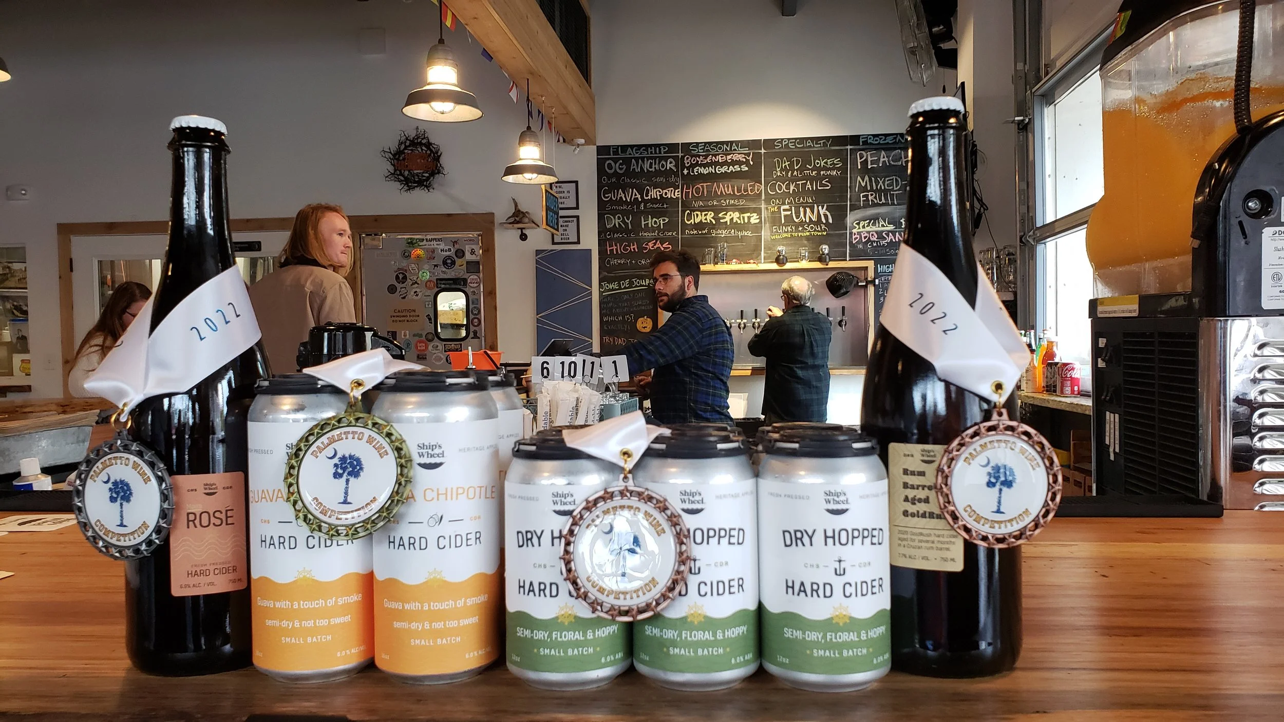
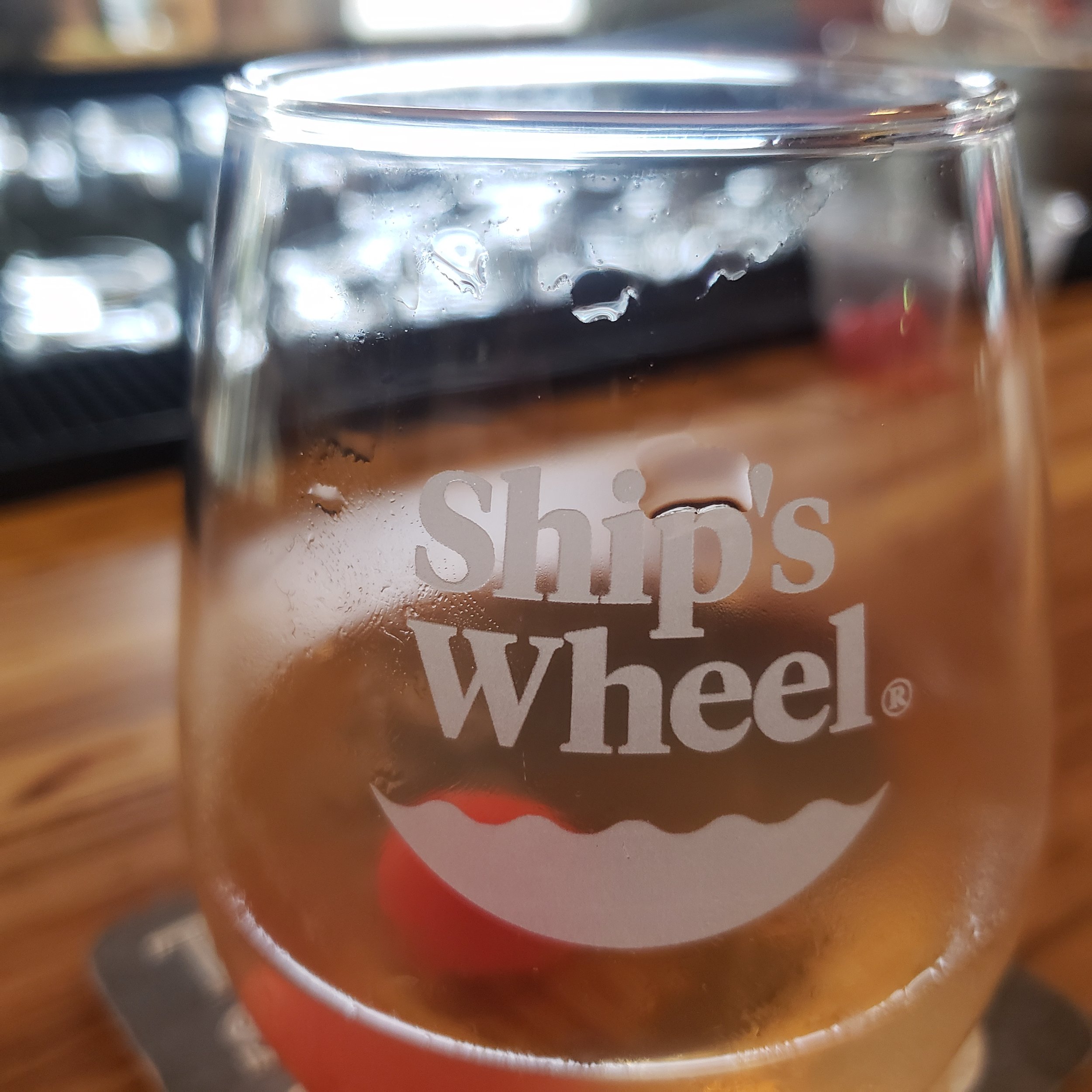
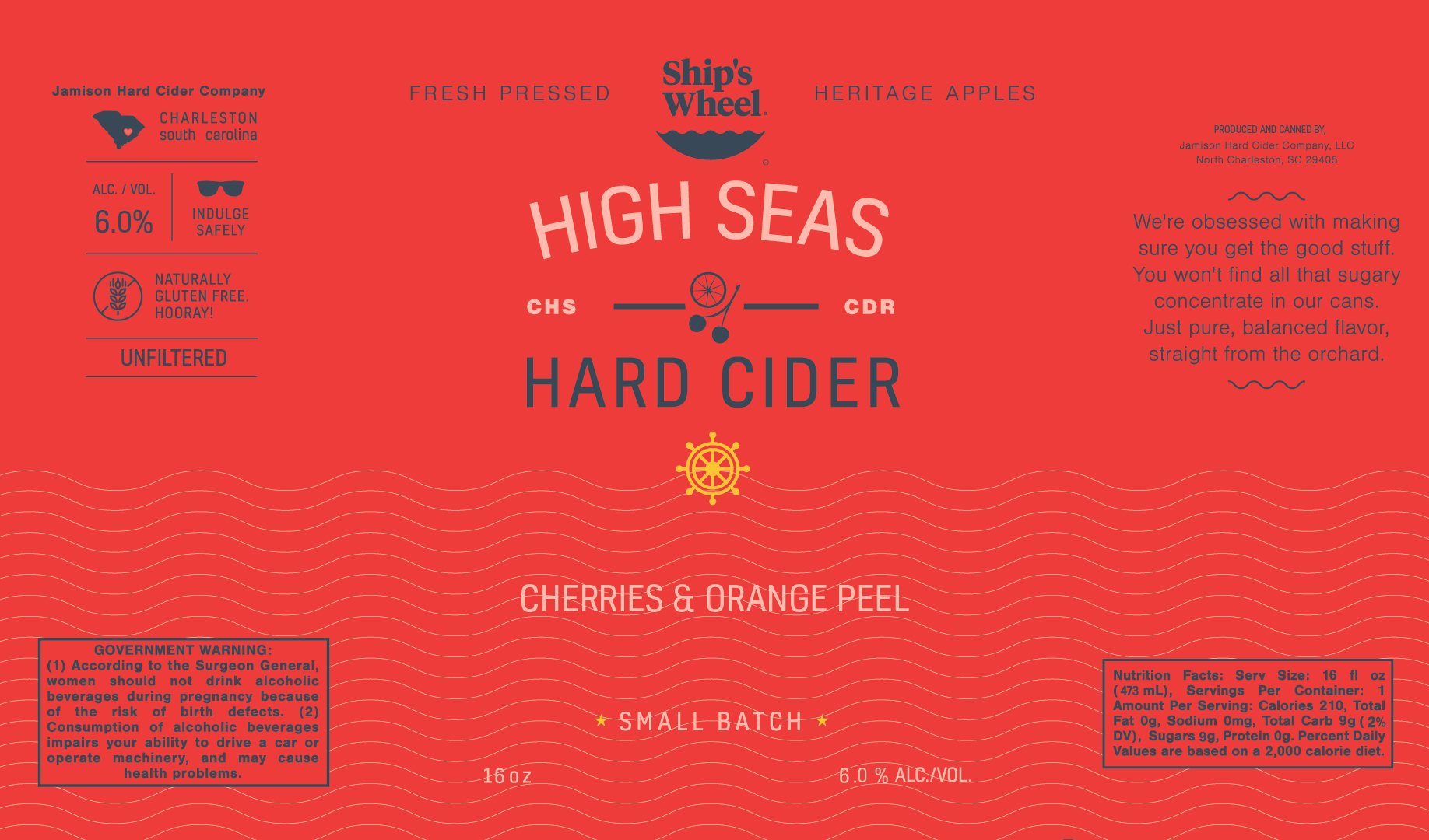
Ship’s Wheel Hard Cider
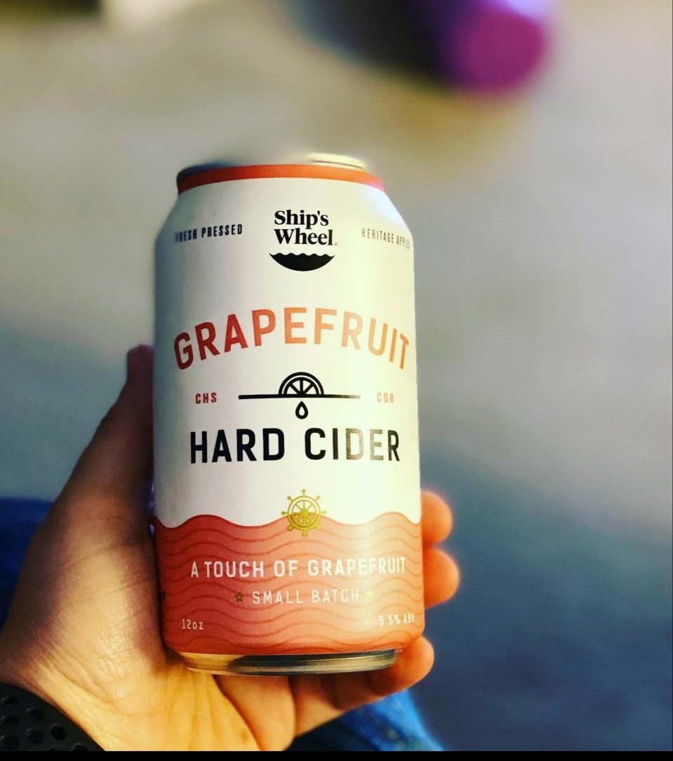
As a key stakeholder in this venture, I held multiple pivotal roles including Creative Director, Head of Operations, and Lead Cidermaker. Our journey began in 2016 as the 1st cidery in Charleston, SC and the Coastal Carolinas. We started out as a distribution focuesed cidery and tried to create a brand that resonates with the community of Charleston and the broader coastal region. Recognizing the potential to introduce many to their first taste of craft cider, we prioritized clarity and coherence in our branding strategy. Our core label design, featuring color-coded variations for distinct flavors, was meticulously crafted to be instantly recognizable and culturally relevant to the coastal aesthetic of South Carolina. Evolving with the market landscape, we transitioned to cans as our primary packaging medium, while continuously refining our visual identity to stay ahead of the curve and maintain various legal compliance details.
Cidermaking Philosophy
Cidermaking is an old art form but commercial cidermaking is a new science.
There is a rich history of cidermaking in the USA and likely more prominent than many realize from the prolfieration of cider apples through Folk legends like John Chapman, Better known as Johnny appleseed, through to the burning of orchanrds during prohibtion. Cidermaking then was more a homesteading, moonshining, and folk art. With that comes a wide variety styles and opinions on what is the true traditional way to make cider. That being said many other places claim their own tradtional way and i can’t seem to disagree with any one claim, in effect they are all correct. As for me, I’m like to say that im appreciative of tradtion but not beholden to it. I strive for balance, in flavored or barrel aged ciders, i aim to keep some apple flavor without becoming overly sweet. in single varietals, or wine focused blends, i aim dryer while hopefully retaining robust notes of the fruit itself.


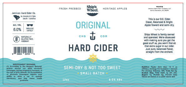
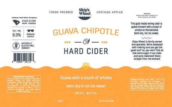
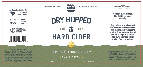
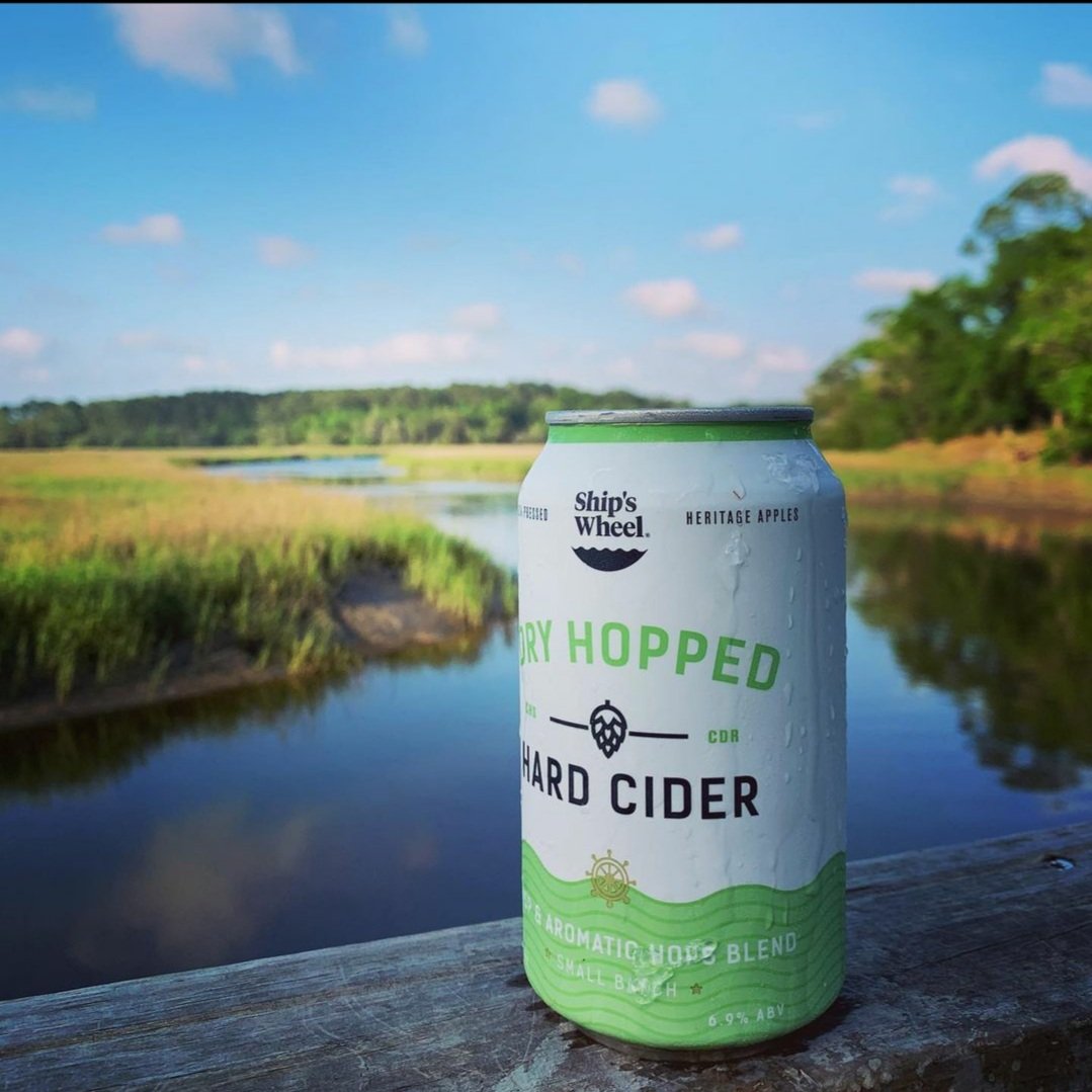
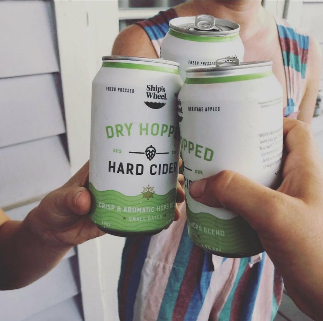
Cans and updated color
As time progressed, our label underwent transformations, embracing cans as the primary package. We also implemented subtle adjustments and color refinements to ensure our visuals remained in tune with the evolving market landscape.
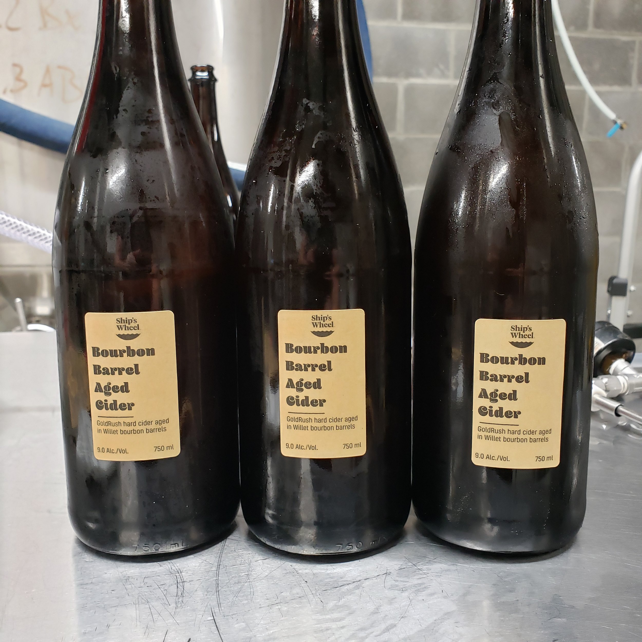
Specialty bottles
We expanded our offerings to include a diverse array of specialty products, ranging from single varietals to barrel-aged creations and high-proof cider cocktails. For one particular bottle, our aim was to evoke a sense of age and maritime adventure, reminiscent of old-world voyages. Drawing inspiration from the understated elegance of European label designs, particularly those found in French and Italian frizzante-style wines, we crafted a packaging that exuded timeless charm.
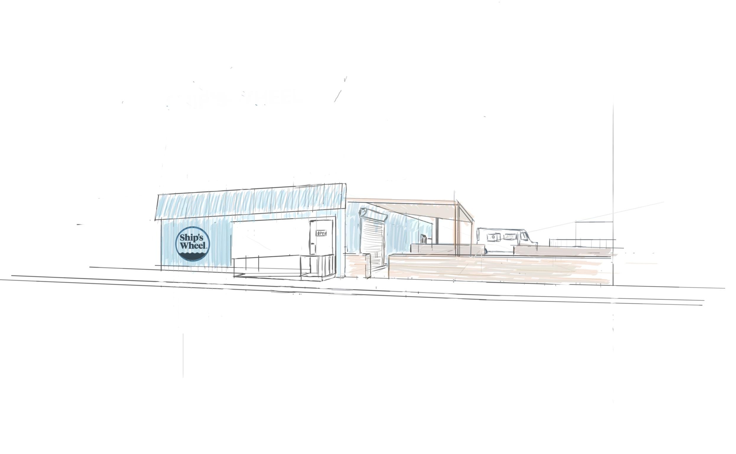
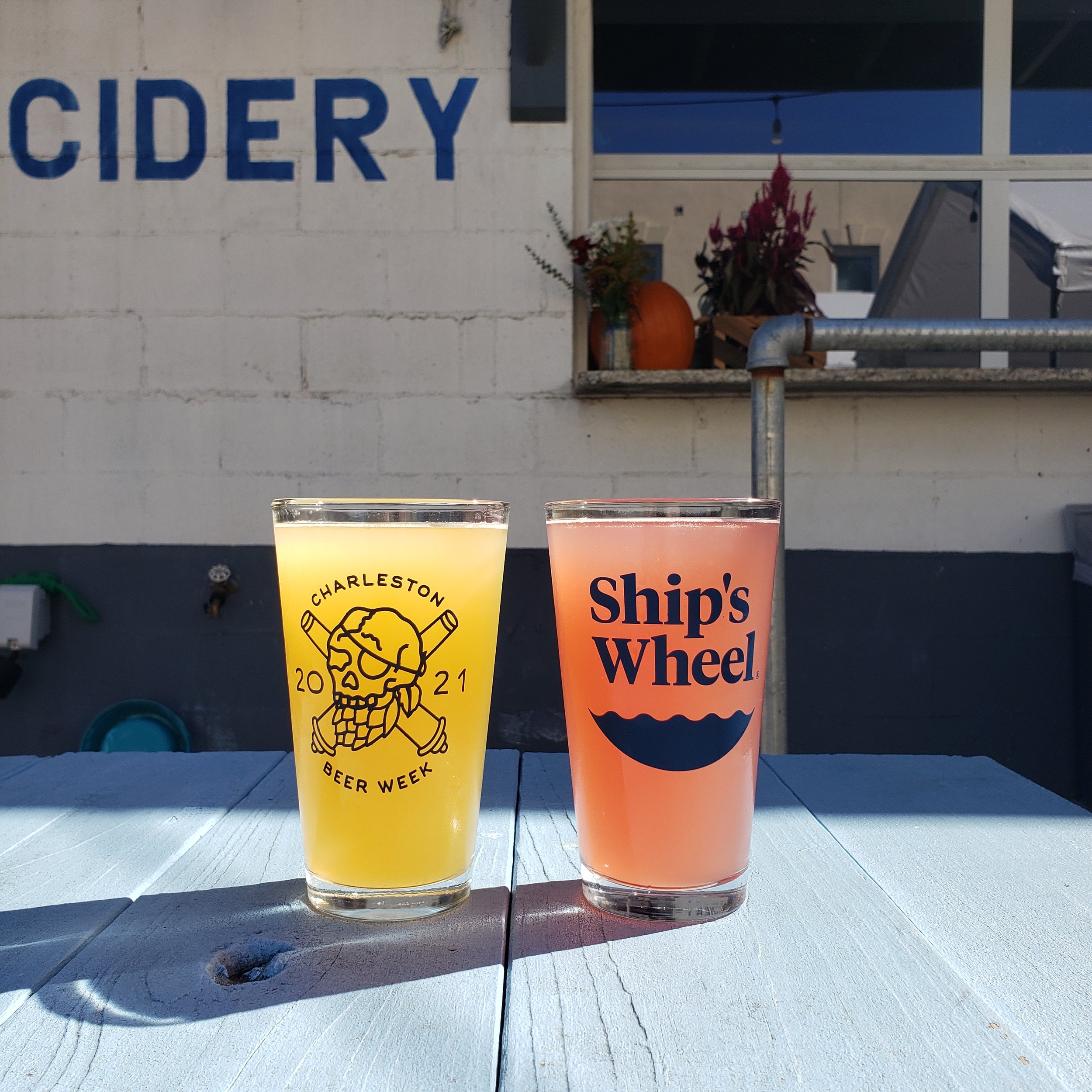
Production and Tasting Space.
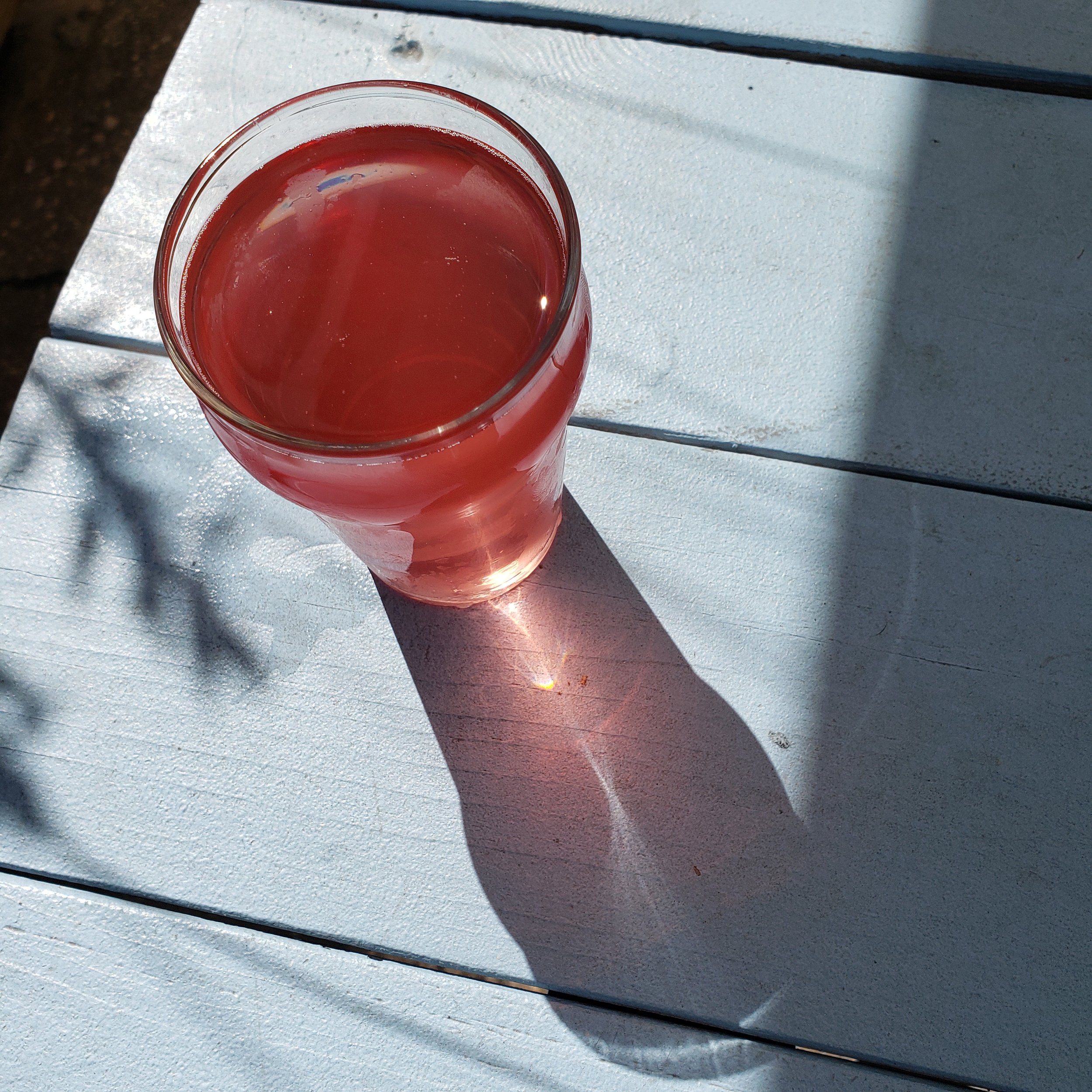
DOCKWINE
DOCK WINE, a sibling brand to Ship’s Wheel, was a 8% ABV 16oz canned Rosé wine. This unique blend combines cider and grape wine infused with grape skin tannins. Specifically crafted for venues and convenience stores, the design features an extra-large font, contrasted drop shadow, and oversized logo. These intentional elements ensure easy visibility and comprehension, even in low-light environments such as dimly lit music venues or amidst a sea of cans in a cooler, positioned 10 feet behind the bar.
